Seaborn Color Palettes and How to Use Them
|
I love how easy it is to make a visually pleasing plot with seaborn color palettes. I’ve compiled a list of available palettes based on data types, and added a few tips on how to use them.
Summary
Some Color Palettes Basics
A seaborn color palette is given either as a List of colors, or a matplotlib.colors.Colormap object.
In this post, I will focus on the first type.
As the default, the palette provided by seaborn is a list is of RBG tuples.
1
2
3
4
5
6
7
import seaborn as sns

palette = sns.color_palette() # Default color palette
print(palette)  # Prints the RGB tuples that make up this color palette
sns.palplot(palette) # Plotting your palette!
sns.palplot(sns.color_palette('husl', 10)) # Seaborn color palette, with 10 colors
sns.color_palette("rocket", as_cmap=True) # Get a CMap
There are some really great posts out there full of useful information, including Seaborn’s own tutorial, but I couldn’t find a clear list of all the pre-made options, sectioned into types.
I tried to list all of them (updated for seaborn 0.11.2), and though I’m sure I’ve missing some, it is more comprehensive than what I was able to find online.
The palette chosen should fit the data, and so, the palettes are given by types. I use the three palette classes seaborn uses in their documentation - qualitative, sequential and diverging, as well as matplotlib’s miscellaneous.
Named seaborn Palettes by Category
Qualitative color palettes
Best for categorical data, as they vary mostly in the hue component (the most noticeable exceptions here are tab20b and tab20c).
This pattern of variations creates different colors with very similar luminosity and saturation, so the palette looks cohesive, and there is no “special” color that stands out compared to the others.
matplotlib palettes, and Seaborn variations
The matlab default palette we all know and love is called tab10, and is also the default palette for most seaborn functions.
The seaborn variations are: deep, muted, pastel, bright, dark, and colorblind, while the matplotlib palettes are tab20, tab20b and tab20c.


What about the rest of the matlab palettes?
There are several Color Brewer and matplotlib palettes that share the same name such as Set2 and Accent.
There is an option to use the original matplotlib functionality by using the mpl_palette function instead of color_palette.
The colors for both are the same, but they handle the palette length differently.
For lengths longer than the original list, the Color Brewer option will repeat colors to return the size requested.
The matplotlib function will return the original list, without any repetitions.
Circular palettes
As the name would suggest, this type of palettes is made out of evenly spaced colors that create a full spectrom, by changing the hue while keeping the brightness and saturation constant.
This means larger palettes can be generated, and therefor it is good to use in the case of an arbitrary (possibly large) number of categories.
These palettes are: hls and husl.


Qualitative Color Brower palettes
As mentioned previously, the default behavior for these palettes is a bit different - unless length is specified, the full list will be returned, which is of varying sizes. This is why I usually use the n argument, just to be on the safe side.
The palettes in this category are: Set1, Set2, Set3, Paired, Accent, Pastel1, Pastel2 and Dark2.
For all of these, there are reversed (add _r to the original name) and dark (_d) variations as well.
Note where the colors repeat due to the palette containing less than ten colors. If you need many distinct colors - go with a circular palette instead.


Sequential color palettes
Large palettes, best for big data ranges. Note that all of the palettes in this category can also be given as a cmap (using the as_cmap=True argument).
Perceptually uniform palettes
This category includes the original Seaborn palettes rocket, mako, flare, and crest, as well as the matplotlib palettes viridis, plasma, inferno, magma and cividis.
All of these palettes also have a reveresed (_r) version.


Sequential Color Brewer palettes
Single-hue and multi-hue (up to three) options, which are: Greys, Reds, Greens, Blues, Oranges, Purples,
BuGn, BuPu, GnBu, OrRd, PuBu, PuRd, RdPu, YlGn, PuBuGn, YlGnBu, YlOrBr and YlOrRd.
The options here include reversed (_r) and dark (_d).


Diverging color palettes
Best used for a wide range data which has a (if there are multiple, these palettes can be manipulated to accomodate that) categorical bound - typically 0, but not always.
Perceptually uniform diverging palettes
Seaborn provides us with the original vlag and icefire palettes and their reveresed (_r) counterparts, as well as the matplotlib palettes coolwarm, bwr, and seismic (again see the remark above about the ColorBrewer and matplotlib counterparts).
I personally like to use vlag when plotting diverging data (with TwoSlopeNorm! Mental note, write about that too sometime).


Diverging Color Brewer palettes
These include RdBu, RdGy, PRGn, PiYG, BrBG, RdYlBu, RdYlGn and Spectral, and their reversed (_r) variations.


Miscellaneous Colormaps
These are matplotlib colormaps that are available in seaborn, but as they were not classified as any type, but rather, each created for a specific task.
For example, gist_earth, ocean, and terrain are all for topological plotting. While we can technically use these as List color palettes, they were not really intended for this usage.
This category includes the following, and their reversed (_r) counterparts: flag, prism, ocean, gist_earth, terrain, gist_stern, gnuplot, gnuplot2, CMRmap,cubehelix, brg, gist_rainbow, rainbow, jet, turbo, nipy_spectral and gist_ncar.
For the colors, see matplotlib’s documentation.
Creating a Customized Color Palette
We can also create our own color palette, either based on colors from existing palettes, or by defining them on our own. I personally prefer to create a custom color theme for each project, and use it throughout, not only when ploting, but in related papers, presentations, and so on.
In this example, we’ll use my current favorite free online tool, Coolors, to select the colors for our new color palette, then recreate it in seaborn.
For those of you who don’t want to spend too much time on that, Coolors has a trending palettes section, from which I chose the following:
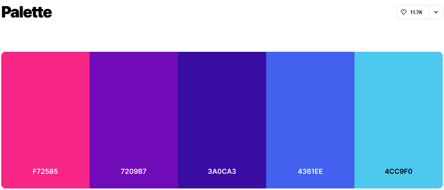
By default, the colors are displayed in HEX format, though you can select other formats as well.
I personally prefer to use it, as seaborn palettes can be created as a list of HEX values, and generally it is an easy to use across multiple technical decks (Python / HTML / PowerPoint / …).
Note that the HEX representation provided by Coolers is missing a starting #, so be sure to add that character to every color code.
1
2
3
4
5
6
7
8
9
import seaborn as sns
from matplotlib import pyplot as plt
tips = sns.load_dataset("tips") # some example data
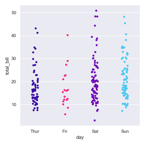
palette = ["#F72585", "#7209B7", "#3A0CA3", "#4361EE", "#4CC9F0"]
sns.set()
# or: sns.set_palette(palette), then the palette argument below is not needed
sns.catplot(x="day", y="total_bill", data=tips, palette=palette)
plt.tight_layout()
And here is the resulting graph:
A bit about colorblind palettes
A few months back a friend asked how to make a graph more grayscale friendly and colorblind friendly. The first thing that came to mind was using hatches for bar plots. Seaborn does have a colorblind palette (mentioned above), but I wondered if there’s anything else I’ll be able to use to adjust my own palettes. I am still looking for more resources on the topic, but in the meantime, I found a really cool free feature on Coolors, aptly named ‘color blindness’:

Clicking the button will reveal a list of types of colorblindness. Clicking each will allow you to have a hint of how color blind people will see your palette, and hopefully avoid pitfalls:

Using Your Color Palette
We can use the palette as shown above.
The thing is, that way we are not really defining a specific color for each hue category, which is fine if there is no need in highlighting specific data, but the color assignment still relies on the order of the data.
If we were diligent enough to define an order to all of our dataframe columns, the order, and the subsequent coloring, would remain the same, but what if we plot only a portion of the data?
In that case, the color assignment for the remaining data may be inconsistent with other plots.
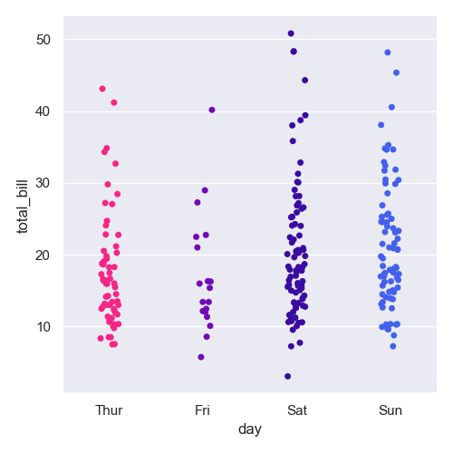
That is why we are going to use the palette argument, but instead of just passing the initial colors, we are going to use a dictionary (which I implement as a global variable on actual projects), mapping each dataset/category to a specific color from the color palette.
This is an incredibly simple trick to have in your arsenal, so much so I feel stupid even typing it, but it has really simplified my entire workflow.
I ardently use it in every new project, not only for color palettes, but also for markers, hatches and line types.
1
2
3
4
5
6
7
8
9
import seaborn as sns
from matplotlib import pyplot as plt

tips = sns.load_dataset("tips") # some example data
# hand picking each colors per category
palette = {'Fri': "#F72585", 'Sun':  "#4CC9F0", 'Sat': "#7209B7", 'Thur': "#3A0CA3"}
sns.set_palette(palette)
sns.catplot(x="day", y="total_bill", data=tips)
plt.tight_layout()
This way, the order of the categories stays the same (since we have not defined a new order on the day column), but we can control the color assignment: