About Bar Plots

Bar plots have been taking up too much of my time lately, so I thought I should write down two very basic customizations, the logic behind them, and some general good practices.
Adding labels, and matplotlib bar ordering
I find that labeling barplots makes them a lot more readable. It is also a great tool for incorporating additional information to an existing plot.
I found myself needing this feature so badly that I ended up implementing it myself a few years ago.
However, since the release of matplotlib 3.4.0, I’ve been replacing it with the new bar label feature.
Let’s load up some data and take it for a spin! I’ll be using a the hue argument to illustrate the more complicated case of grouped bars.
1
2
3
4
5
6
7
8
9
10
11
12
13
14
15
import seaborn as sns
import matplotlib.pyplot as plt

tips = sns.load_dataset("tips")
x = "day"
hue = "time"

palette = sns.color_palette("colorblind", 2)
barplot1 = sns.barplot(x=x, y="tip", palette=palette, hue=hue, data=tips, ci=None)
plt.legend(loc='lower right')

for container in barplot1.containers:  # For grouped barplots - if not using "hue", there is a single container
    barplot1.bar_label(container, fmt='%.2f') # use size for font size, color for, well, color...

plt.tight_layout()
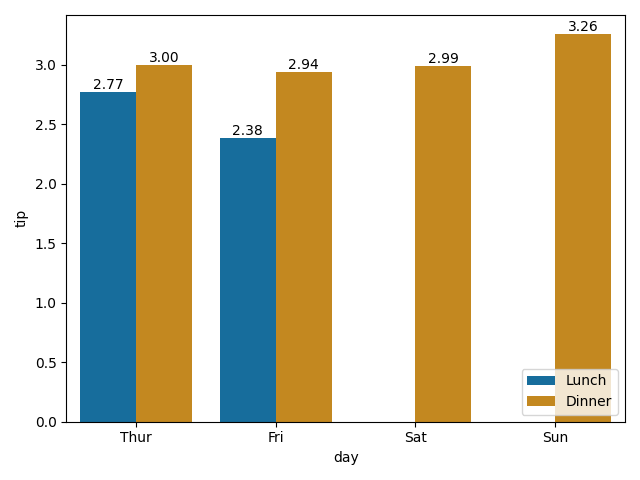
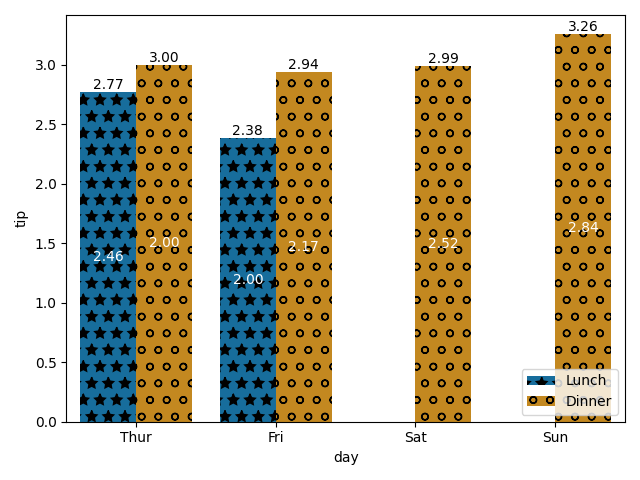
The default mode sets the labels to be the appropriate y value. The API allows to put labels either on the edge of the bar (as seen above, the default setting) or in the vertical middle of the bar (label_type='center').
What if we wanted to add some custom labels, using perhaps different columns of the DataFrame?
The first step would be to collect these new labels, and then apply them using the labels parameter.
In order to apply them in the correct order, we first need to understand the order matplotlib implements. Let’s use the bar number as our label.
1
2
3
4
5
6
7
8
num_of_categories = len(tips[x].unique()) # == len(container)

for hue_num, container in enumerate(barplot1.containers):
    # Container: a group of all the bars of a specific hue
    # In case there is no hue, there will be only a single container: num_of_categories == 1
    labels = [hue_num*len(container)+i for i in range(len(container))]
    # labels = [num_of_categories*hue_num+i for i in range(num_of_categories)] # Alternative
    barplot1.bar_label(container, labels=labels, label_type='center')

Each container is a group of all the bars for a specific hue, starting with the first bar on the left, even if there is no data to display for that category (which is why there are no “2” and “3” bars - there are no actual bars to label here).
In other words, the group order is given by the hue column’s order - in this case, the time column, and the order within each group is the order of the x parameter.
Note that these two are both categorical data columns, but are not ordered, as:
1
2
tips[hue].dtypes
tips[x].dtypes
outputs:
1
2
CategoricalDtype(categories=['Lunch', 'Dinner'], ordered=False)
CategoricalDtype(categories=['Thur', 'Fri', 'Sat', 'Sun'], ordered=False)
This is where things get dicey. When we collect our new labels from a DataFrame, we need them to be in the same order as the bars so they’d match. Therefor, resorting the DataFrame during analysis could lead to a mismatch between labels and bars.
How can we avoid this? Don’t iterate over your DataFrame rows. Instead:
- Iterate (hue) groups based on the order in the plot - using
df[hue].dtypes.categories.values. - For each group, assign a set of labels based on grouped data, which will automatically be will by the correct order. If the data displayed is not an aggregation of statistics but rather a single row, iterate using
df[x].dtypes.categories.valuesand find the relevant row information usingtips[tips[hue].isin([hue_label]) & tips[x].isin([x_label])].
Armed with this new knowledge, let’s prepare labels that indicate the average size of a group (size column) for each bar.
1
2
3
4
5
6
7
8
9
10
labels = []
for hue_label in list(tips[hue].dtypes.categories.values):  # Category list defines the order
    grouped_data = tips[tips[hue] == hue_label].groupby(x)["size"].agg({"mean"})
    new_labels = [f'{mean_size:.2f}' if mean_size > 0 else '' for mean_size in list(grouped_data['mean'].values)]
    labels += new_labels

num_of_categories = len(tips[x].unique())
for hue_num, container in enumerate(barplot1.containers):
    hue_labels = [labels[hue_num*num_of_categories + i] for i in range(num_of_categories)]
    barplot1.bar_label(container, labels=hue_labels, label_type='center', color='white')

And if we want to make sure everything is on the up and up, we can always print out the data:
1
tips.groupby([hue, x])["size"].agg({"mean"}).dropna()
and here we’ll get:
1
2
3
4
5
6
7
8
                 mean
time   day
Lunch  Thur  2.459016
       Fri   2.000000
Dinner Thur  2.000000
       Fri   2.166667
       Sat   2.517241
       Sun   2.842105
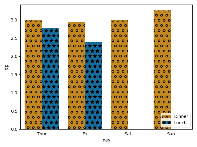
Adding hatches
matplotlib added support for hatches too, but there is no integration with Seaborn just yet (hopefully soon?), so here, I still use a more customized approach - using patches to apply the hatches.
It is important to note that like the container, which contains (:sweat_smile:) a representation of all bars, including those with Nan values, there is a patch for every bar, even “missing” ones.
1
2
3
4
5
6
hatches = ['*', 'o']

for num, patch in enumerate(barplot1.patches):
    patch.set_hatch(hatches[int(num / num_of_categories)])

plt.legend(loc='lower right')  # To update the legend with the patches
To keep the hatches consistent across a project, I strongly suggest defining a global dictionary with the mapping of label to hatch type:
1
CAT_TIME_HATCHES = {'Lunch': '*', 'Dinner': 'o'}
In the case of hatches, we need to make sure the values of the dictionary are ordered in the same way the DataFrame column is. This is easily done by defining a categorical order on each category column. FYI, the Seaborn support for dictionary color palettes saves us that workaround for coloring:
1
2
3
4
5
6
7
8
9
10
11
12
13
14
15
16
17
18
19
20
21
22
23
24
25
26
27
28
29
30
import seaborn as sns
import matplotlib.pyplot as plt
from pandas.api.types import CategoricalDtype

# First, define the desired order for relevant columns
BASE_PALETTE = sns.color_palette("colorblind", 2)
CAT_COLORS_TIME = {'Dinner': BASE_PALETTE[1], 'Lunch': BASE_PALETTE[0]} # The order doesn't matter
CAT_HATCHES_TIME = {'Dinner': 'o', 'Lunch': '*'} # Changing it up
CAT_ORDER_TIME = CategoricalDtype(list(CAT_HATCHES_TIME.keys()), ordered=True)
CAT_ORDER_DAY = CategoricalDtype(['Thur', 'Fri', 'Sat', 'Sun'], ordered=True)


# Load the data and update the order
tips = sns.load_dataset("tips")
tips["time"] = tips["time"].astype(CAT_ORDER_TIME)
tips["day"] = tips["day"].astype(CAT_ORDER_DAY)


# Now we can plot whatever we want!
x = "day"
hue = "time"
num_of_categories = len(tips[x].unique())

barplot2 = sns.barplot(x=x, y="tip", palette=CAT_COLORS_TIME, hue=hue, data=tips, ci=None)

for num, patch in enumerate(barplot2.patches):
    patch.set_hatch(list(CAT_HATCHES_TIME.values())[int(num / num_of_categories)])

plt.legend(loc='lower right')  # Updating the legend with the patches
plt.tight_layout()